Monday, September 2, 2013

Copperplate Calligraphy—A New Teaching Adventure

My students have heard me say, time and again, that teaching calligraphy has made me a better calligrapher.  Through written and verbal instruction, and hands-on demonstration, I need to be able to explain the forms I am creating and relate individual letters to a bigger picture, calligraphically speaking.

Copperplate sample; quote by Alfred Fairbank 

I was first introduced to the Copperplate style more than twenty years ago; I have been doing Copperplate in the form of commissioned work for at least the last ten years.  I have been asked to teach this hand, but have never felt ready until now.  Why?  I think it's a matter of finally feeling confident in recognizing the little details that make these letters so beautiful.


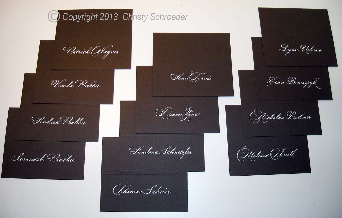
Dr. Ph Martin's Bleedproof White on gunmetal metallic paper

Aiming for consistency between the related letters is always key when learning a  new hand.  Sometimes it's difficult to realize that we need to "learn to walk before we run" and that "flying lessons" come when the basic forms are fully understood. 
 
Rose gold (mixed acrylic) on blue; Hunt 22 nib
    
 But Copperplate lends itself well to some creative flourishing, as well as the opportunity to use a variety of different capital letter styles.

Walnut ink on white; Hunt 22 nib; Spencerian style capitals

And we don't always have to write on a straight line! 

Winsor & Newton Permanent Yellow Deep gouache; Brause Rose nib
So, beginning in October, up to ten unsuspecting souls will join me in "walking lessons" with the pointed pen, and in six weeks we will progress toward "running"...well, maybe a trot. :)
Flying lessons will have to wait for the next class—I have to leave something to keep them coming back!


Sunday, August 11, 2013

Inspiration in Unlikely Places

This week has been full of summer-time chores.  You know the kind...mowing lawns, pressure washing the house, scraping old paint and laying the foundation for new paint...the list goes on.  Needless to say, I missed posting and sharing my studio workings with you this week!  

However, I DO have something to share—something that perhaps one of you can identify for me... When visiting Pike's Place Market in Seattle, WA last November, I spotted this little gem nestled in the sidewalk.


This quote defines the moment I decided to quit my steady job and take the leap into a full time calligraphy business.  I have no regrets and as scary as the words may seem, they still fill me with hope.

 I'm always telling my husband to "look up" more often because of all the scenery he might miss.  Ha!  The lesson was mine to learn...if I hadn't have been looking down, I would have missed this altogether!

If anyone has any info about this (including the author's name—I'm having a difficult time seeing the letters between the R's and a Google search did not help), I'd love to hear from you!


Enjoy your week and I'll be back soon with another "working studio" post.
Peace & Blessings to you...  

Thursday, August 1, 2013

Calligraphy for an Elegant Wedding

I  LOVE that there are brides, grooms,and wedding designers out there who feel the way I do 
about incorporating calligraphy into a wedding, making the smallest details unforgettable. 

I have had the pleasure of working several times with Sinclair & Moore Events (formerly Steven Moore Designs) and Brittany O'Brien of Spruce Stationery & Design.  This creative team pulls out all the stops when it comes to designing gorgeous weddings.  When their clients, Andrea and Som, wed last Fall, a bit of Pilgrim's Quill Calligraphy added a flourish to their special day—from Seattle to India, and New York to Germany and Sweden...


The invitations were mailed in boxes—
white ink in gray... 


...the dessert menu informed guests of the delectable selections awaiting them...


...and the Guest Book sign invited guests to leave memories for years to come.


Simple, yet elegant, placecards adorned each place setting.


But the largest calligraphy project for this wedding was the seating chart.  Here are photos of my step-by-step process in its creation...


Creating a Seating Chart


Seating charts can be organized a number of ways, and it's always helpful to work with a wedding designer who has a specific idea of what they want done.  Sinclair & Moore Events prefers a chart organized alphabetically by last name, rather than by table number, making it much easier and faster for guests to locate themselves on the chart.


First, I determine the number of names per alphabet section.  My column divisions are then determined based on the number of names in each section, trying to balance the overall chart vertically.


Next, I write the longest name followed by the table number, to determine how large the writing can be and the overall column width.  The perimeter margin space and necessary column width will tell me how much space I can leave between columns.
Space for the heading and the title is also measured.


I create a scale diagram on graph paper with all of the measurements, taking lots of notes as I proceed.  A very wise book maker (thank you Michael Jacobs!) always says, "Measure twice, cut once!"  The same applies to calligraphy when there is no room for error.  All of the measurements are then transferred confidently to the large paper and ruled with white chalk pencil (Fons & Porter). 


 With measurements in place, the heading is written first because it is the largest and most crucial—if I make a mistake here, at least I have not written the entire chart!  I write the heading on a separate paper that acts as a placement and measuring guide, placed above the area I will be writing.  (Some prefer to lightly pencil in the text and ink over it, but I find I lose some of the spontaneity in my writing with this method.)


With the completed title in place, it's time to begin the bulk of the chart...


...section by section, no distractions, and a block of time that I can complete as much as possible in one sitting or one day. 


When the ink is completely dry and the information has been proofread for errors (Yikes!  Heaven forbid!), the chalk lining is erased carefully and the chart is ready for the big day!


Sunday, July 21, 2013

Calligraphy Practice: An Accordion Journal


Full accordion


My calligraphy buddy, Suzie, and I have started an annual trek to Sun Peaks, British Columbia, for a personal retreat focused on all things calligraphic.  Well, wine and good food are involved too, but that's another blog topic. 
Usually I have a difficult time deciding what to do when faced with a multitude of calligraphy and art supplies.  So, this year I went prepared with some accordion folded cuts of Arches Text Wove and a plan...


Folios 1 and 2

Ever since first seeing lettering artist Joke Boudens accordion folded calligraphy books in the calligraphy journal Letter Arts Review, I have itched to create one of my own.  A vacation to the beautiful ski resort, Sun Peaks, in Canada seemed like the perfect opportunity to give it a try.


Folios 2 and 3

Knowing where and how to start is always difficult.  I purchased a bendable ruler a couple of years ago but had never used it, so that was my first goal—use my unused tools!  I began drawing curved lines, then made up text as I went along.  Without quotes on hand, I decided to chronicle our trip day by day—words
and phrases that will jog memories in the future. 


Folios 3 and 4


  The Details...


XS PITT pen, sumi ink, watercolor pencil


I took photos while out walking and incorporated some of the local elements into my accordion.
The paver stones and the pattern they formed worked well with the curved text I'd already established.


Because I do not draw in detail, the simple graphic nature of the local logo was easy to incorporate and set the "illustration tone" for the rest of the folios.


And yes, there was a GIANT bug on the deck...with antennae a foot long, I'm sure!

The small lower case Roman letters on the right were made with a Hunt 22 pointed pen nib and sumi ink.


The mandala is a logo painted on the side of the Sun Peaks Lodge in the village.  
PITT fine line pen (XS), watercolor pencil, gold mica powder made into ink with gum arabic and water.


Small text—Hunt 22 pointed pen nib, pressure and release

There was no plan other than to balance the lettering with illustrations, and to balance the weight and size of the blocks of text.

The next accordion I make will be done on Arches Hot Press watercolor paper or Stonehenge.  Though the Arches Text Wove is fabulous for pen and ink and watercolor, lettering in a small size is difficult on this surface.


The text here is Uncial script, written 1/8" high.  I used a Brause EF66 pointed nib that is clipped and formed into a very small broad edge—a bit rough on the Text Wove paper. 
 
There is still a day to be recorded to make this project complete, but I came home with a nearly finished accordion that was fun to create and fulfilled a goal.


Sun Peaks wildflowers


The view down...this is why I don't ski!


Suzie and Christy—Sun Peaks last year, at the Kevin Costner concert


Thursday, July 11, 2013

Calligraphy Name Play

My Mom and Dad sponsor a child through an organization, and though writing letters is strongly encouraged, they are not permitted to send gifts.  So Mom asked if I would write their sponsor child's name in calligraphy.  I love that she asked me to do this, because who doesn't like to see their name decorated and in pretty colors?


Our names are a gift in themselves—our identity.  I've often found the meaning of a person's name to suggest qualities of the individual.


"Astrid", in Danish, means "divine strength".  "Nicolle" means "overcomer" and "victory of the people".


Strength and Victory—what an awesome combination!   


The Decorative Details...


When I have some extra time to decorate an envelope, this is my favorite style!  By drawing forms, I can leave the letters open for lots of vibrant color and decoration.  Here, I used Faber-Castell PITT pens with some color layering using Prismacolor pencils.  Can't forget the light gray shadowing (also PITT), a touch of sparkle on the edges using Sakura Gelly Roll Clear Star pens, and white dots made with a Sharpie poster paint pen.  Love these products! 


When I want to add a decorative touch but am pressed for time, I fall back on brush lettering—it can bounce, it can play, and can be formal or informal.  Again, Faber-Castell PITT pens are GREAT—they are available in a huge array of colors, waterproof when dry, AND can be used as a watercolor—who'd have thought?  The flowers were also made with the brush tip, simply laying the brush on its side and pressing onto the paper.


And last but not least, trusty formal Italic should always have a place in a calligrapher's repertoire.  These aren't my best, but "pretty in pink" will suit a little girl.  This is done with a ZIG marker and Prismacolor pencils.  Layering Prismacolor pencil over marker color is an easy way to add depth while still being able to control the amount of color.   

It's all about play, right? :)


Saturday, July 6, 2013

Calligraphy Outside the Box

Over the past few years I have had the pleasure of working with one of Bellingham's most creative wedding invitation designers.  Kerri Efendi (Kerri Efendi Designs), is one inspirational gal who likes to push the limits in design.  As a result, she has challenged me a few times to think "outside the box" of my usual formal calligraphy and try something new.  I love the challenge!


A New Challenge

Last winter Kerri asked me to literally think—or rather, letter—"outside the box."  She was putting together a wedding invite for a Seattle Met Bride & Groom Magazine photo shoot and the "envelope" was a flat metal box.  The color theme was "Red, Red, Wine" so she spray painted the box with a burgundy red paint, and gold became the accent color to match the inside of the box.

The finished box

For the calligraphy, "Something free-flowing and fun", she said.  I had some reservations about writing with a metal nib on a spray painted metal box, but to my delight, it worked beautifully! 
The final piece, along with Kerri's invite, appeared in the Winter/Spring 2013 issue of Seattle Met Bride & Groom.    

trials of the name with variations in the capital letters


As any calligrapher can attest, a 'free-flowing' style can take more practice and warm up than traditional formal styles if the end result is to appear effortless.  There is still structure underneath those dancing forms!


working out the size and address lines to contrast the name


As always, I can see what I may have done differently—changing a letter form here and there—but in the end it worked as I had
envisioned it.  


The Details...

For those who like the details, my practice work was done with Moon Palace Sumi ink and a Brause Rose pointed pen nib on Canson Pro Marker Layout paper.  Once I'd completed a sample on paper, I scanned the name separate from the address lines and set it up as a finished layout using InDesign.  Once approval of the work was received, I used Saral white transfer paper to lightly trace/transfer the design onto the box with a stylus.  Then I was ready to do the final lettering with the Brause Rose nib and Dr. Ph Martin's Copperplate Gold Calligraphy Ink (my favorite!).


 What I learned in the process:

  • as lightly as I pressed, the white transfer material did not want to completely rub off of the painted metal surface;  
  • paint on metal takes at least several days (ideally a week) to dry and cure.   

Sunday, June 30, 2013

Calligraphy Inspired By A Saint

"Out of something old, you compelled me to make something new."


Just a quick follow-up to my previous posts, "What's In A Name?" and "Calligraphic Time Travel."  I came across this short report from the BBC today—a little more background and some visuals of places I wrote about, as well as my hero saint, Cuthbert.  I hope you enjoy!

"Lindisfarne Gospels: Who is the saint who inspired them?"

Friday, June 28, 2013

Calligraphic Time Travel

Most of my commissioned calligraphy work is for weddings, but I also love teaching calligraphy.


I’m also a bit of a nut when it comes to the history of my craft.


Although the focus of my classes is teaching others how to do calligraphy, I firmly believe in the importance of knowing when and where a style came from historically. 


A couple of years ago I decided to take a new approach and do a historic monologue for the history presentation in my Uncial calligraphy class.  I spoke as the voice of Bede, a monk, scholar, and historian from the 7th century—the time period of the particular Uncial script I was teaching.


But why stop there?  When asked to do a brief calligraphy demonstration at the art store where I teach, I decided to expand on the monologue idea.


Donning a bowler hat (thanks, Grandpa!) and fake mustache, I became Edward Johnston, the “father of modern calligraphy” who developed the Foundational hand, based on the 10th century Ramsey Psalter manuscript.  


But I also teach Italic…off went the mustache and on went the Renaissance scholars hat (did you see the teaser photo here last week?) and I spoke as Arrighi, Writing Master of the 16th century. 


What follows are some still shots and short video clips of my presentation.  I can assure you, I won't be quitting my day job and taking up acting, but this was fun to do!  The video clips are not complete, so I’ve included my monologue script with more detail for those who are interested.  
I hope you enjoy it!   


Uncial


My name is Bede and I am a monk from the monastery of Jarrow in Northeastern Britain.  I was born in the year 673.  I am also a scholar and an historian, and I have spent many years of my life recording the history of the English Church and People.

A vast number of beautiful manuscripts were commissioned and produced from my fellow monks and scribes at Jarrow.  One in particular, however, stands out among the rest—the St. Cuthbert Gospel manuscript.  This manuscript was created shortly after my birth in the late 7th century and contains the Gospel of John. With its binding of red leather and Celtic interlace patterns, and its calfskin vellum pages of Uncial script, this little manuscript miraculously survives as the most well preserved and fully intact book of its time.
 

an enlarged sample from the St. Cuthbert Gospel
The Uncial script found in the St. Cuthbert Gospel was the common hand of my day in the monastery scriptoriums, and in fact, has a long and geographically widespread history.  Various forms of Uncial are found in manuscripts dating from the 4th through the 8th centuries.  The style traveled as books were borrowed and passed from region to region.  But, I understand that the Uncial of the Cuthbert Gospel is the model used for new students here, among you, today.  The round form of this capitular script makes it an ideal hand for new scribes to learn.


Although Uncial had such a long and prominent life, its characteristics were adapted and changed over time, eventually taking the form of the Caroline Minuscule scripts…


Foundational


Good afternoon.  My name is Edward Johnston, and I became known as the “father of modern calligraphy.”  I must say, it happened quite by chance—here is my story…
 

I was born in 1872 and, from the age of three, grew up in England.  I always had an interest in both art and science.  I dabbled a bit with lettering and drawing as a child and that interest remained with me into adulthood. 
 

My original career focus was in medicine, but in 1898 I discontinued my medical studies and decided to accompany my cousin on an expedition through the United States and Canada.  In fact, we spent time in Seattle, as well as an extended camping stay on Salt Spring Island in British Columbia.
 

But before this expedition, the direction of my future studies took a dramatic turn.  While staying with friends in London and preparing for my travel abroad, I had the great fortune of being introduced to several kind gentlemen involved directly and indirectly with the late William Morris and the crafts movement in England.  I was encouraged to pursue my interest in art—specifically, lettering—and guided in how to study ancient manuscripts at the British Museum.  I guess you could say I found myself in the right place at the right time—I was offered a job teaching illumination and lettering at the Central School of Arts & Crafts in London, following my expedition to the United States! 
 

as E.J., with a sample from the Ramsay Psalter
My development of the Foundational calligraphy hand for my students was based on my studies of a 10th century manuscript, the Ramsey Psalter.  This manuscript was written in a Caroline minuscule script that emerged from a form of Uncial over the course of several centuries.  My Foundational hand was excellent for new students pursuing calligraphy studies, and to this day, with its round form and upright structure, is still recognized as the most fundamental hand in calligraphy for a new student to learn.


Although the 10th c. Caroline Minuscule was highly readable and an excellent model for my Foundational hand, it was not the most speedy way of writing.  The pen is lifted for every stroke and the letters do not join together.  Those characteristics were to follow several centuries later, with the emergence of the Italic script of the Renaissance scholars…


Italic  


Greetings, friends.  My name is Arrighi, and I am a Writing Master of the Renaissance period.  I was employed as a professional scribe by the Papal Chancery (administrative offices of the Catholic Church) from 1519 to 1523. 
 

Scholars of my time were tired of the heavy, burdensome appearance of the former Gothic scripts that were prominent in the 14th and 15th centuries—you may be familiar with the style, as seen in Gutenberg’s early printed books.
We Renaissance men were looking for something new—a fresh face in our written scripts.  But we also needed a style suitable for faster writing, in transcribing the non-printed documents of everyday business affairs.  We looked back to the earlier Caroline Minuscule styles from the 12th century and adapted these to suit our needs.   


What developed was the Humanist Italic Corsiva—better known among you aspiring calligraphers as Italic. 
As a Writing Master, I was the first to publish an illustrated instruction book for writing the Chancery Italic.


Other Writing Masters after me, liked to “show off” a bit for their students, creating Copy Books with ornate capital letters and extreme flourishing.


Conclusion


The Stampadoodle lunchtime demo group
So, you see my friends, the task we undertake as calligraphers has a long history—one filled with elements of faith and devotion of early monastery scribes, the adaptation of writing styles to suit specific needs of a time period and people, and the artistic pursuit that brings out the beauty of written words.  We are all connected across the centuries through the unifying force of the written word, the dance of the pen, the flow of the ink, and the cushion of our pages that become part of history for all time. 


Reference material


The History of the English Church and People, Bede
The British Library website and manuscript reference

Edward Johnston: Lettering and Life, Ewan Clayton
Historical Scripts, Stan Knight