Monday, December 28, 2015

Calligraphy for Christmas Poetry

I have a wonderful returning customer who selects a Christmas poem each year to share with those she sends cards to.  For the past three years, she has commissioned me to create 100 inserts of her selection, written in calligraphy.
 
Italic Lettering


Because the pieces are scanned and printed, I write the  lettering larger than the finished size in black on plain bright white paper, such as Canson Pro-Marker Layout.  I scan the lettering, make any corrections needed using Photoshop, then reduce and set up the final for print using Adobe InDesign.  The finished pieces are 4 1/4" x 5 1/2", allowing me to set up four on a page for print with crop marks.


Title lettering: Uncial


Starting with parent sheets (26"x40") of
Arches Text Wove paper, I tear it down to 8 1/2"x11" sheets for print, then tear these to the finished size after print using my crop marks.  Tearing allows for more natural looking "deckle" edges.


Main text lettering: Batarde


The embellishment is different each year for the individual poems, but I have consistently used FineTec gold watercolors and Winsor Newton watercolors, and either a Winsor Newton 000 or Princeton liner brush to apply the color.  


Title lettering: sloped Uncial


Merry Christmas everyone, 

and many blessings to you as we enter the New Year.  
May 2016 be full of inspiration!

Sunday, December 20, 2015

Calligraphy & Lettering Art for Cards: Part 3

Cards for Adults


The final part of this series is focused on greeting cards created for adults.

Often I find the artistic portion easier to create than composing the written message.  But the advantage of creating your own card is that the customization is unique for that person...the colors you know they like, the appropriateness of the lettering for the occasion, and the overall mood created by the artwork.  Thankfully, having a style that is "all over the place", as I do, is beneficial!  I love the formal flourishing of Copperplate (Congratulations card below), but I also love the ability to play with funky letter forms and shade with my colored pencils.
I hope you enjoy the selection below!  Let me know what you like!


Above and below: Neuland style lettering, ZIG Calligraphy Marker, 
and Prismacolor pencils on Strathmore drawing paper


Faith, Hope, Love: Drawn letter forms, Faber-Castell PITT markers, 
Prismacolor pencils on Strathmore Drawing paper

 
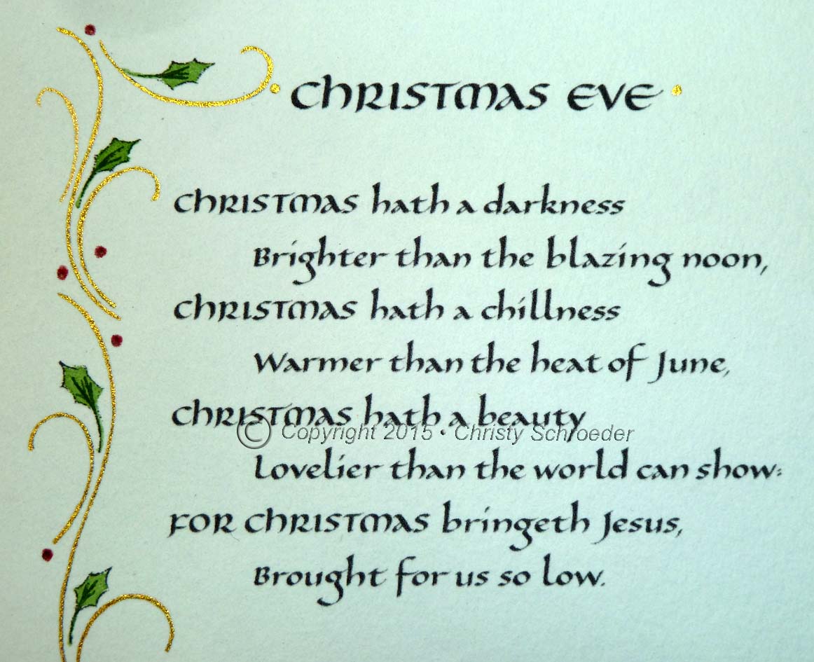
Drawn lettering and design, PITT markers, colored pencils, and glitter pen


Some recent drawings I've been working on, inspired by photographs of tiles...
I scanned and reproduced my drawings in black and white, then printed 
and colored individually.  Lettering was added with Prismacolor Verithin pencils.


 This card was designed for a client who had been gifted a pair of shoes from Seattle designer Luly Yang.  The colors used were inspired by the shoes themselves.


This last selection was designed and made for a personal friend who was recently promoted
to Colonel in the United States Air Force.  


 I found the Air Force logo online...I traced the image,creating a simple black and white 
line drawing that I then scanned, resized in Photoshop to fit my card dimensions, 
and printed onto Strathmore 300 Series Drawing paper.  
Next, I wrote the Copperplate calligraphy message in Ultramarine Winsor & Newton gouache
and added highlights to the left edge of the lettering with Dr. Ph Martin's Silver Calligraphy Ink.  I chose to do the lettering first, knowing if I made a mistake it would be at this stage.  I didn't want to spend the time painting the logo, to then make a mistake in the calligraphy and have to start over!  
Last, I painted the logo with black India ink and the Dr. Martin's Silver, which has a great metallic shine!

Thanks for visiting this series!  Next up...a little post-Christmas sharing of Christmas projects!


Sunday, December 6, 2015

Calligraphy & Lettering Art for Cards: Part 2

 Cards for Kids...Using DieCuts

In my last post I focused on using stickers to embellish handmade cards for kids.
However, if you have time and access to a good die cut machine, you can get pretty creative with your designs, making your cards even more unique.

Train Die-Cut Accordion Fold Card


Stampadoodle & The Paper Cafe, my local fine paper and rubber stamp store, has an amazing selection 
of die-cuts and fabulous cardstock.  Bright colors and polk-a-dot paper seemed appropriate 
for this one-year-old's birthday card.  The window cut-outs in the train cars allowed me to add 
sticker images and a photo of the birthday boy as the engineer!


More stickers for the front with drawn lettering, and brush pen for his name on the envelope.


Chorus Line of Kids Die-Cut


Another accordion fold card, this one utilized a die-cut silhouette image of five children holding hands.


Although each panel of the accordion fold repeats the five images, I didn't want the children to look the same.  I drew the faces and hair, then my husband and I sat down to work together drawing 
and coloring the clothes on each figure.  No two are the same.


Once the kids were in place, I drew the balloons, signs, kites, presents, etc, spelling out the 
birthday message.


Finally, the Neuland lettering was added along the bottom with a calligraphy marker, and outlined 
with a fine line pen for a more playful look to these block letters.

Starting out with some great die-cuts and stickers can make the card creation process flow a little faster and easier than starting with a blank slate.

Coming up in my next post...calligraphy and hand lettering in cards for adults!

Calligraphy & Lettering Art for Cards: Part 1

Cards for Kids

When I was in the first grade at Roosevelt Elementary in Burlington, WA, I had a teacher, Mrs. Sanchez, who would hand draw cards for her students.  Nothing felt more special than receiving one of those cards, knowing it was made just for me...and now in my 40's, I still have them tucked away in a box of good memories.

Her example stuck with me and now I make cards for the special little kids in my life.  Bright colors, simple designs, some fun stickers or die-cuts and something is created that will hopefully make the kiddos I know feel as special as Mrs. Sanchez made me feel.

Using Stickers to Embellish


What could be happier than Suzy's Zoo stickers?
The colors and cheerful images are my starting point for design.  With the message in mind, I may
add a few drawings (the balloon, polk-a-dots,
and daisy flowers) to fill the extra space.


I wrote the Happy Birthday messages with large Faber Castell PITT brush markers.  Highlights were added with colored pencil to deepen the base color of the marker in the top section of the lettering.  White dots are added last with a Sharpie Poster Paint pen.  


Here, my drawings were the main design, with the centers spelling the child's name.  The butterfly stickers added the finishing touch.  A little gray marker shadowing on the left side of the butterflies gives them a slight 3-D effect.  Arches Text Wove paper, Faber Castell PITT markers used as watercolor, pointed pen and sumi ink for the lettering.


This was a recent baby shower card for a friend of mine.  The baby's name, Gabriel, was drawn in my "Whimsical Letter" style and shaded with three tones of blue colored pencil.  The name was mounted with foam tape to make it stand out from the card base.  The grass is layered cut cardstock, stickers added for fun and color, and the "welcome" message written with a PITT fine point pen, size XS.


"Look who bloomed!" was hand drawn, based on an image I saw on a rubber stamp years ago.  Adding the baby's name to the flower pot personalized it just for her.  My Whimsical Letters,  watercolor, and colored pencil on Arches Text Wove paper mounted on cardstock.


Be sure to check back for Part 2 of Cards for Kids, using die-cuts!