Showing posts with label FineTec Gold watercolor. Show all posts

Tuesday, July 26, 2016

Pen, Ink, & Paper in Harmony

A majority of my calligraphy work has allowed me to select a paper of my choice, which can create a bit of "laziness" when it comes to selecting the best materials under varying circumstances.

This past week I was commissioned to write a number of words on a photo matte.  A variety of lettering styles were requested by the client, and basic black ink with gold highlights.

I sat down to practice and picked up my trusty Brause nibs—the nibs I learned with 26 years ago and generally my "go-to" choice.  These worked great on my practice paper and for the initial paste-up layout I provided the client.

However, when it came to writing on the actual matte surface, the Brause were way too stiff, not making complete contact with the matte for clean strokes.  I went from feeling very comfortable with the process to, "Yuck!  This stinks!"

practice on the off-cuts


A-ha...that's why calligraphers should always have a variety of nibs in their tool kit...whether they be broad edge, pointed pen, or brush pens.  Pen, ink, and surface/paper must be in harmony with one another to give a good result!
 
The solution was my more flexible Mitchell nibs, and using them without a reservoir.  The flexibility allowed beautiful contact between nib and paper/matte surface, resulting in clean strokes that were a dream to create!

gold highlights added with Fine-Tec watercolor


The framer we worked with was wonderful in providing me with the off-cuts from the matte, allowing me to practice and find this harmony with my tools.


the finished matte


 It's easy to become complacent with our favorite things.  But expanding your knowledge and experience with a variety of nibs, inks/gouache, and papers will make the creative experience more enjoyable. 


Monday, December 28, 2015

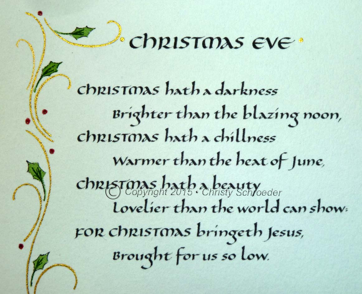
Calligraphy for Christmas Poetry

I have a wonderful returning customer who selects a Christmas poem each year to share with those she sends cards to.  For the past three years, she has commissioned me to create 100 inserts of her selection, written in calligraphy.
 
Italic Lettering


Because the pieces are scanned and printed, I write the  lettering larger than the finished size in black on plain bright white paper, such as Canson Pro-Marker Layout.  I scan the lettering, make any corrections needed using Photoshop, then reduce and set up the final for print using Adobe InDesign.  The finished pieces are 4 1/4" x 5 1/2", allowing me to set up four on a page for print with crop marks.


Title lettering: Uncial


Starting with parent sheets (26"x40") of
Arches Text Wove paper, I tear it down to 8 1/2"x11" sheets for print, then tear these to the finished size after print using my crop marks.  Tearing allows for more natural looking "deckle" edges.


Main text lettering: Batarde


The embellishment is different each year for the individual poems, but I have consistently used FineTec gold watercolors and Winsor Newton watercolors, and either a Winsor Newton 000 or Princeton liner brush to apply the color.  


Title lettering: sloped Uncial


Merry Christmas everyone, 

and many blessings to you as we enter the New Year.  
May 2016 be full of inspiration!